


25 Jun 2020
Movement in Colour
Colour has always been important in defining movements whether it's representative of accepted political parties or associated with radical movements set on shaking up the status quo. Here the SODA team delve into four different movements and uncover why particular colour palettes have been used and how they've helped shape different messages.

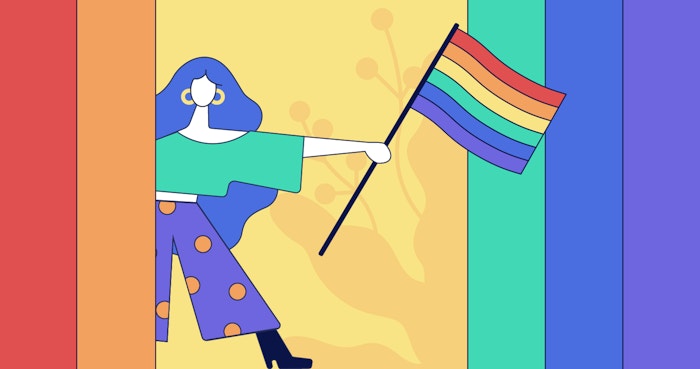
Redesigned LGBTQ+ flag
The LGBTQ+ community are anything but dull. Vibrant, bold and unapologetic, the multi-coloured rainbow seems the perfect emblem for the diversity that defines queerness. The rainbow first became a symbol of LGBTQ+ rights back in 1978, when artist and drag queen Gilbert Baker was asked by Harvey Milk to create a symbol of pride for the gay community. When asked why he chose the rainbow, Baker later explained: “our job as gay people was to come out, to be visible, to live in the truth.” Bold and bright was the only way.
As queer rights progressed, showcasing support for the LGBTQ+ community has become a divisive factor in attitudes towards brands and governments alike. To some, the rainbow has now become a token of pinkwashing, an inauthentic messaging tactic by corporations in an attempt to win over queer consumers.
Nonetheless, the rainbow flag remains a central part of queer activism, undergoing its own evolution as society progresses. Baby blue and pink stripes have been added to accommodate the trans community, whereas black and brown striped now represent queer people of colour. Much like the LGBTQ+ community itself, the rainbow is resilient yet flexible to the ever-changing world around us. What colours will be added next?
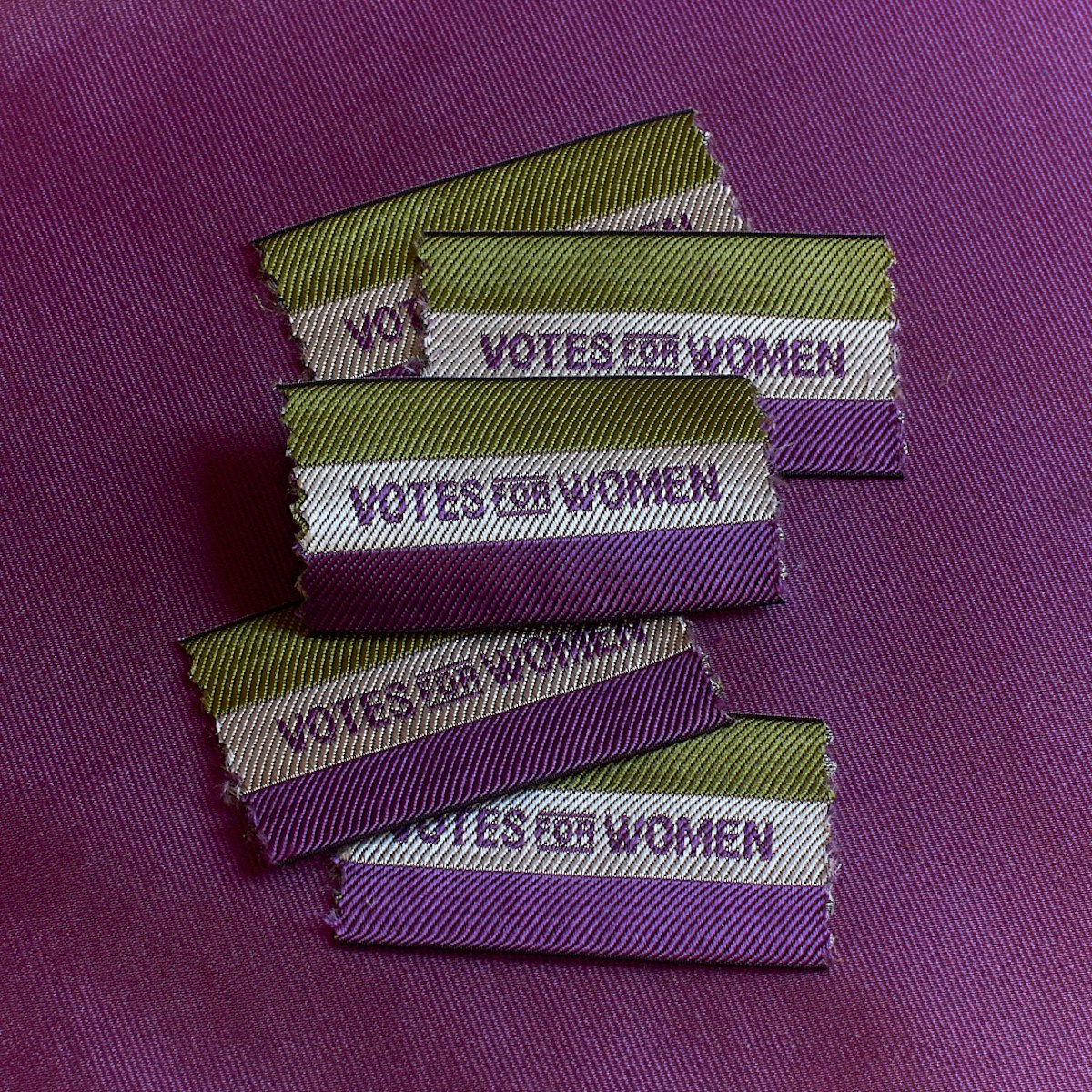
Votes for Women Badges
The Suffragette movement is one of modern history’s earliest examples of art and branding impacting a political moment and leading to national change.
Sylvia Pankhurst, a prominent activist, designed the majority of the Suffragette’s early branding. Educated at the Machester School of Art and later at the Royal College of Art she was greatly influenced by the Arts and Crafts movement and was involved with the often forgotten Artists’ Suffrage League and the Suffrage Atelier. Pankhurst designed much of the early protest art for the movement including signage and posters.
The movement’s famous tricolour was designed by Emmeline Pethick-Lawrence in 1908. Pethick-Lawrence, co-editor of Votes for Women introduced purple for loyalty and dignity, white for purity and green for hope. Suffragettes were told to wear their colours “as a duty and a privilege” with pride. Pethick-Lawrence encouraged Suffragette’s to wear their best white dresses with their new tricolour sashes to the Women’s Sunday, a large-scale rally in Hyde Park in June 1908. This was the first time the colours were worn en masse by the group. This uniform was not without detailed thought. The new look was designed to be feminine and persuasive. Despite the image painted at the time of frumpy men-hating women, very few Suffragettes actually looked like this or subscribed to this image at all. The Suffragettes knew that if they were to attract more women to their cause they needed to present themselves as feminine and aspirational. Indeed, this moment in Hyde Park was a triumph for the movement and in a way, a triumph for branding. Department shops such as Selfridges and Liberty soon sold tricolour branded products such as ribbons, belts, rosettes, shoes, soap and even underwear. It became fashionable for women to align themselves with the struggles towards suffrage through the three colours. High society jeweller Mappin & Webb even sold valuable brooches set with amethysts, pearls and emeralds.

Black Lives Matter Logo
As the battle for injustice against people of colour reaches new heights the Black Lives Matters movement has again found itself at the forefront of global perception and has galvanised its followers with its powerful visual identity rooted in emphasising the power of the black community it strives to liberate.
Established by three black community organizers: Alicia Garza, Patrisse Cullors, and Opal Tometihe in 2013, Black Lives Matters enlisted the Design Action Collective, an Oakland-based creative studio that typically works with nonprofits and social change organisations, to create its logo. As is the case with many similar organisations, they had a limited budget and chose to position the Hashtag that lends the organisation its name as the focal point for the identity.
The ultimate goal was to create something that was easily replicable, something that anyone interested in joining the movement could recreate themselves on banners, t-shirts and placards without the need for professional printers or previous design skills.
With a three-day turnaround, Design Action Collective created a simple wordmark using the font Anton in all-caps, black letters on a strong vibrant yellow background. Josh Warren-White who worked on the project stated that the contrasting colours helped give it “bold, strong, militant” qualities. Yellow contrasts so strongly against the key colour black in the rest of the identity it is clear to see why it was such an inspired choice. It is the most visible colour on the spectrum, it pops out whether painted on a placard and viewed from far away or used in mural form so that a satellite can see it from space, it is the perfect, practical choice for the act of protesting, allowing messages to be seen easily amongst huge crowds and against a myriad of colours and images. However it carries with it much emotional resonance and aptly mirrors the whole ideology of what the movement represents. For many it represents optimism, something BLM strives to fight for amongst those that are oppressed, it is the beacon of hope that shines in the darkness of such contempt and systematic hatred. This combination of practicality and powerful, emotional nuance has given the black community a powerful voice that we can all see and that hopefully we listen to and help spread as far as we possibly can.

Extinction Rebellion Poster
If you’re not aware of the Extinction Rebellion logo and movement you’ll recognize it by sight. Since the global environmental movement’s emergence in 2018 the simple graphical style of its posters, flags and stickers have been a mainstay of their action to compel governments to avoid tipping points in the climate system. Central to the power of these “angry but peaceful” protest graphics is the stark colour palette used.
Unlike other modern political movements XR’s art style has not been defined by one creative director and instead chooses to channel its egalitarian nature into its graphics, which are all designed collaboratively by a volunteer art group. "We needed to create a movement that looks radically different to all eco movements previously, because they failed," said Clive Russell, a member of Extinction Rebellion's art group. This has meant that while green is part of the colour palette (“You can’t be an eco movement and not use Green”) other bold and bright colours, 10 to be exact, have been used to define the character of extinction rebellion. This breadth of colour has been used to define the intersectionality of the movement which serves as a warning that time is running out for many species including humans who, ourselves, are at risk of societal and ecological collapse.
The simple functionality of XR’s graphical style lends itself to be taken by supporters outside of the official art group who can download the graphics, typeface and the colour palette and create their own protest collateral. Between these three core elements the aesthetic holds together and allows XR’s ideas to spread via their designs across the globe.
Words by the SODA team