11 Sep 2020
To Build a Place
As we all very slowly transition back into ’normal’ life we are once again able to reclaim the areas of the Capital that had, for the better part of half a year, become desolate ghost towns and a far cry from their regular selves. Although we find ourselves with a new found freedom to re-inhabit said areas, what is it exactly that drew us to them in the first place?
The answer it seems lies in the way each distinct location presents its unique history, the voices of those who live within it and the wider role it plays in the cities overall identity, through their visual placemaking design. From the signage for streets to the architecture of communal spaces, every element has been designed with the unique identity of each in mind.
So this week the SODA team explore some of the most interesting and creative of these placemaking projects from across the Capital, hopefully inspiring you to head out your front door mask in hand (and diligently applied to your face) and explore the exceptional design that makes London the brilliant city it is.
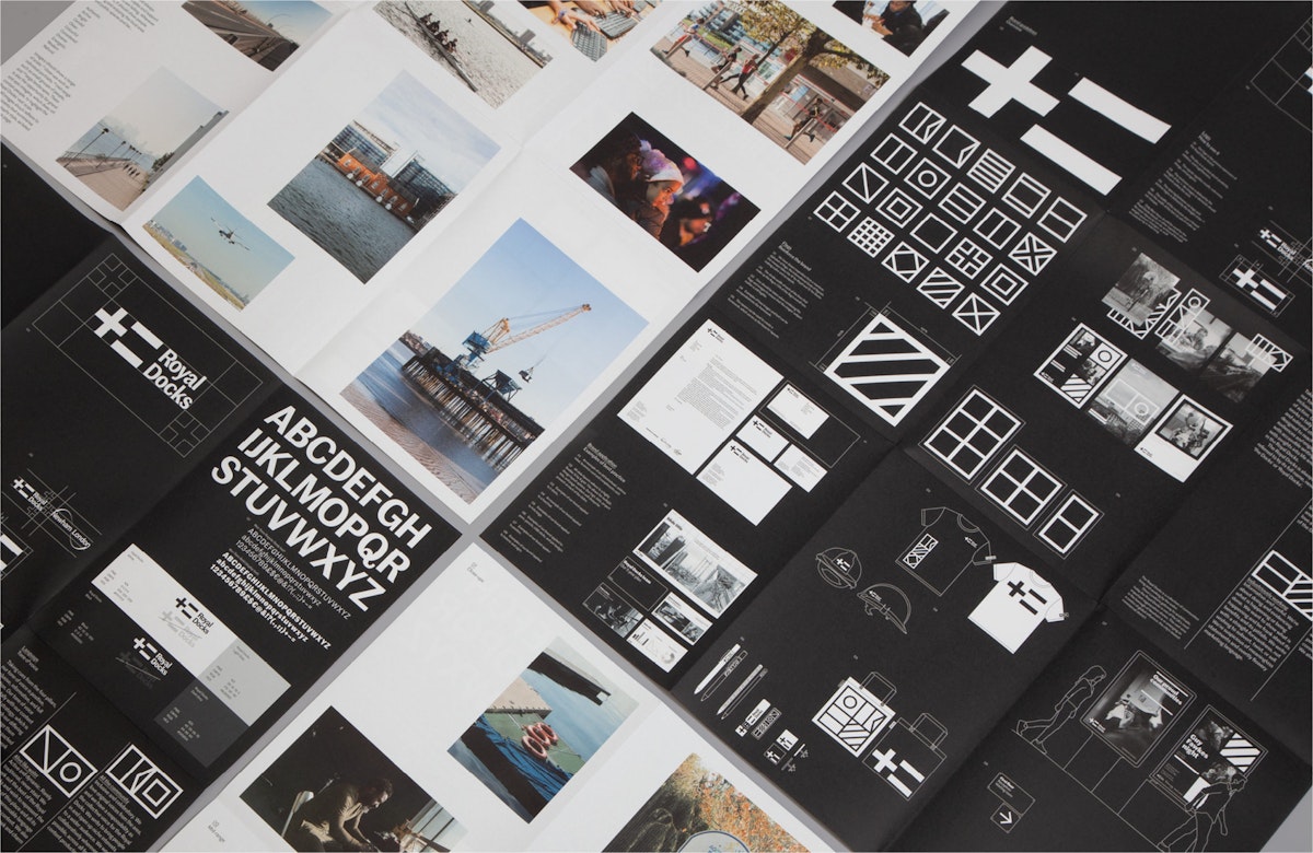
Royal Docks by DN&Co
The Royal Docks is London's most important regeneration project, covering 1,200 acres and 12 miles of waterfront. But despite its proud past as the city's gateway to global trade, it was lost from many people's mental map of London. With the Mayor of London and Mayor of Newham, DN&Co were enlisted to create a brand to celebrate the area’s nautical history in addition to establishing a platform that connects communities living and working around the docks. The all encompassing idea was to create “straight-talking” branding and communications for the area, which would clearly and simply set out planned changes. Identities for urban developments often rely on bright colours and CGI renders to paint a rosy vision of the future but founder Joy Nazzari, “wanted to create something more direct” which is reflected in a black and white colour palette and an “honest” tone of voice. One of the most interesting parts of this project is the logo itself which takes the R for Royal and D for Docks from the code, making a plus and an equals. The plus is a symbol of positivity, addition, and togetherness. The equals signifies results, doings, and progress. Together, they encapsulate the Royal Docks’ past and future, both as an existing place and a regeneration project that's defining what good growth looks like.

Lewisham by Studio Raw
Nestled among the boroughs of South East London, Lewisham is known for being diverse and multicultural, whilst simultaneously maintaining a strong sense of community. To give the borough a brand refresh, Studio Raw and Jamie Paton designed a new visual identity for the area that plays on this paradox. The identity uses a pair of contrasting typefaces, mixing a simplistic sans serif with a more expressive line-drawn style to highlight the ‘I’ and ‘am’ of Lewisham. By emphasising ‘I am’, the branding captures a sense of pride in the community, whilst also reflecting the individual voices of the borough. This tactic is highlighted by the tagline ‘I am/we are Lewisham’, helping to assert the sense of collectivity within its community. The branding proved successful; Lewisham was subsequently named London Borough of Culture for 2021, which will see £1m donated to the area to fund cultural events for the local community.
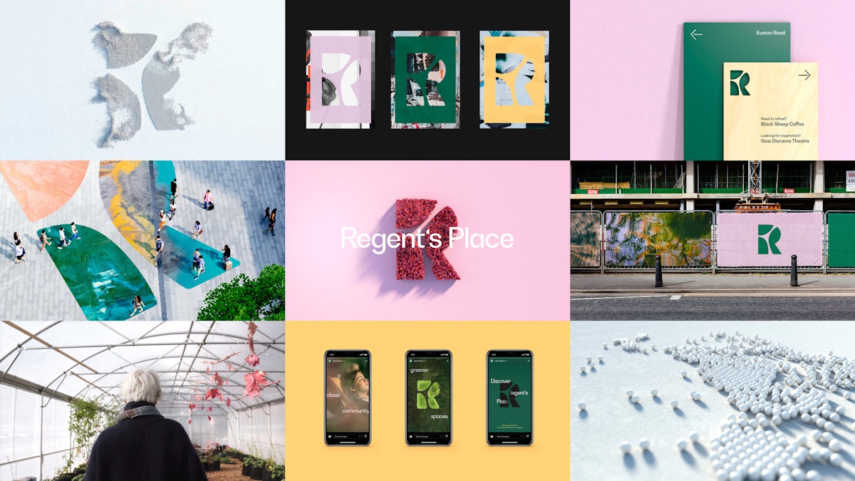
Regent's Place by DixonBaxi
Brand and design consultancy DixonBaxi has created a new brand identity for Regent's Place, a central London development featuring food and drink offerings, a theatre, an arts centre and more. The development itself is focused on "responsible urbanism", according to the design agency, using sustainable architecture, green spaces and an emphasis on connection within the community. The new designs were created to become the foundation of the development for the next decade as the area around Euston Road continues to change rapidly.
At the heart of the identity is the idea of unifying three distinct districts that intersect at Regent's Place: the Knowledge Quarter (a small area near Bloomsbury housing sites like The British Library, The British Museum, The Wellcome Trust and University College London); Camden; and the West End. As such, there's a rich mixture of arts, science, research and creativity. Every element of the design was influenced by the natural environment, the organic lines and natural colours aim to create a "more calming experience".

Stratford by Thomas Matthews
Since being selected as the venue for the 2012 Olympic Games, Stratford as an area of London has perhaps received the city’s largest-scale makeover in the succeeding years. However, with the Queen Elizabeth Park and neighbouring Westfield shopping centre largely acting as Stratford’s main attractions, the ‘original’ identity of the area has been in danger of being forgotten about.
The London Borough of Newham, where Stratford is situated, therefore commissioned communication design agency Thomas Matthews to create a brand revamp for Stratford aimed at shining a light on the town centre’s unique identity. The aim was to encourage visitors to explore further afield to make the town centre a destination in itself. The graphic approach to the newly designed cultural trails, colourful crossings and other public realm improvements were inspired by the grid-like aesthetic of Stratford’s Victorian shop fronts as a nod to the area’s pre-Olympic architectural history.
Meanwhile, the crisp and bright patterns provide a contemporary, engaging and optimistic feel to partner the rebranding’s acknowledgement of the ‘original’ Stratford. This has collectively enhanced Stratford’s cultural offering, helping to raise the profile of local businesses.
- Words by The SODA team
